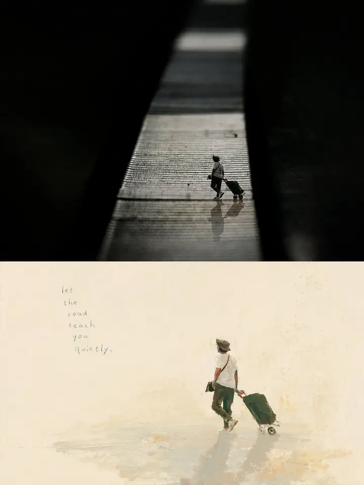
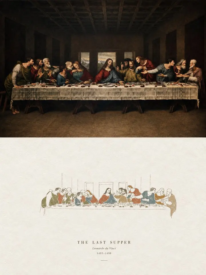
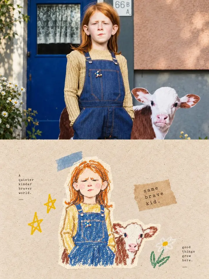
Turn each photo I upload into its own separate premium design poster; no collage, one output per photo. 3:4 vertical layout in two tiers: the top half is real photography, the bottom half a painterly distillation of the photo's core image, echoing each other like reality and memory.

The top half keeps the original photo, preserving the subject's identity, structure, pose, texture, natural light and color mood, with only a light refined grade for an art-magazine, exhibition-photo feel. Extend the background naturally to fit, but never stretch, distort or alter the subject.

The bottom half extracts the photo's most recognizable **subject, outline, pose and narrative relationships**, finds the core theme, visual metaphor or aesthetic relationship, and recreates only what is most worth remembering. Don't reproduce the full scene or turn every object into illustration; remove irrelevant surroundings, keeping one core subject and a few relationships, like a reorganized visual memory.

Use an **extremely pale background with large empty space**: a near-white tint matched to the photo's temperature and mood, slightly warm, cool or tinted, but light, clean and quiet.

Composition stresses **visual weight, scale, negative space, directional tension and imperfect symmetry**. The subject may be offset, partly cropped, suspended or set low. If what moves you is the relationship between person and space or between two things, keep that relationship.

Painting language: loose, naive yet artful **opaque gouache, acrylic, oil pastel and dry oil paint**, with blocked color, hand-drawn outlines, scraping, layering and strokes that don't fully fill. Forms may be slightly clumsy or exaggerated, but identity and key pose must stay accurate. Keep pauses, corrections, exposed ground and accidents.

Palette: from the photo's temperature and liveliest colors, translate into a **warm, bright, slightly naive artist's palette**: cream yellow, apricot, peach orange, coral pink, old rose against sky blue, pale teal, mint and gray green, with tiny accents of brick red, orange red, deep green, earth brown or black. Local color shifts are allowed if harmonious. Chalky, opaque, slightly faded yet lively; avoid all-over muted gray, pastel filters, muddy browns and saturated digital color.

Text: a few meaningful words or fragments drawn from the theme, mood or memory, entering the empty space or following the subject, slightly hand-written; restrained.

Overall: pale ground, vast empty space, few subjects, warm lively color, naive hand-drawn feel and a clear visual metaphor, like an indie book painted by an artist. Avoid full scenes, filled backgrounds, object lists, slick vector, cartoon templates and meaningless filler.