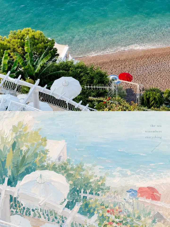
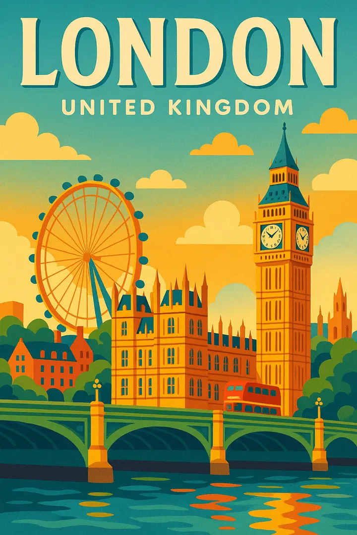
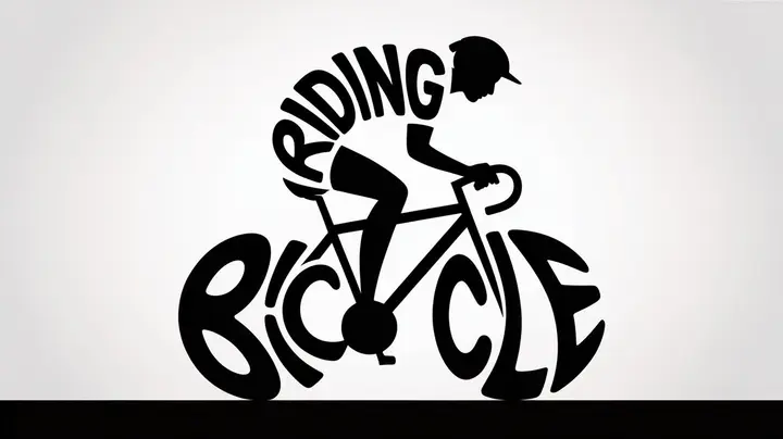
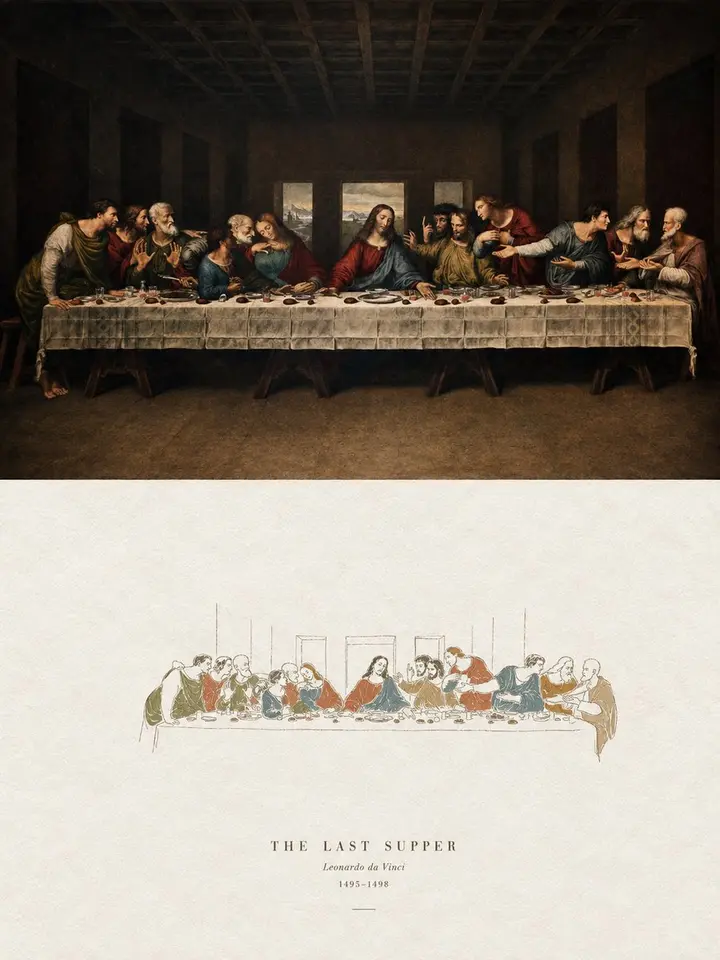
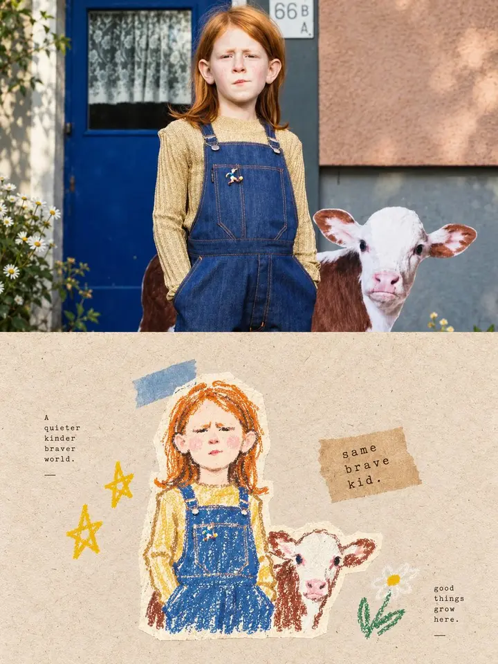
Turn each photo I upload into its own high-end design poster; no multi-image collages, one output per photo. 3:4 vertical layout in two tiers: real photography on top, a painterly reconstruction of the subject's story below.

Top half: the original photo, keeping identity, structure, pose, texture, light and color mood, with light, refined art-magazine grading; extend the background if needed, never distort the subject.

Bottom half: extract the most recognizable subject, outlines, pose and narrative relationships and rebuild them as a more artistic, well-designed painting. Do not trace the photo or use sticker collage; keep only the most memorable visual cues, compressing the scene into clear subject relationships, a few key color planes and quiet white space, recognizable yet distilled like a memory.

Style: gentle, bright, soothing pastel painting, like gouache, acrylic or oil pastel. Soft color blocks, clear light brushstrokes, a handmade feel. Avoid stickers, slick vector, 3D plastic and realism.

Composition: professional, with clear focus, layering and white space. The subject may be off-center, enlarged, cropped or placed lower-center; keep only a few background elements.

Color: soft, airy, slightly desaturated, unified. Pale powder blue, misty blue, sky blue and airy cool blues set the mood, balanced by ivory, cream, light beige, soft gray-green and architectural neutrals, with small touches of blush pink, soft peach and dusty rose for a soothing, social-media-friendly feel. Avoid muddy grays and harsh, saturated contrast.

Text: nothing fixed or menu-like. Generate only a few meaningful words or short phrases from the subject, action, setting or mood, placed in white space or as corner notes; small and editorial.

Overall: like an indie visual booklet or art travel journal; gentle, bright, calm, modern and relaxed. Avoid realistic landscapes, clutter, heavy outlines, templates, cartoon looks and over-decoration.