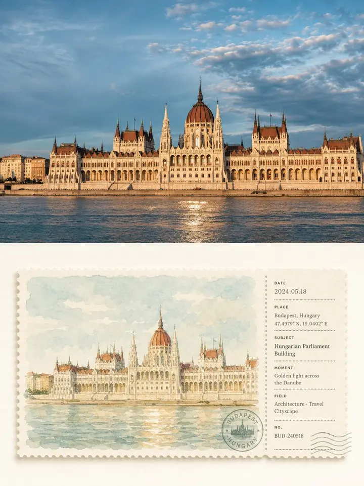
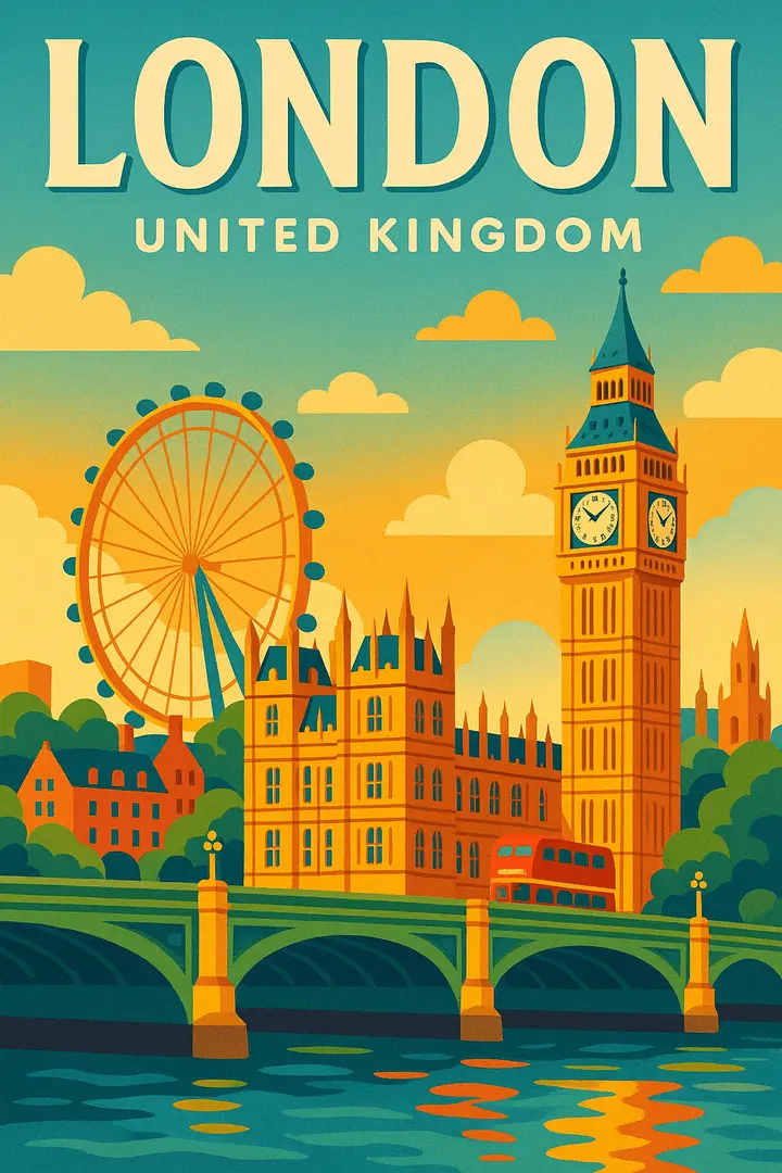
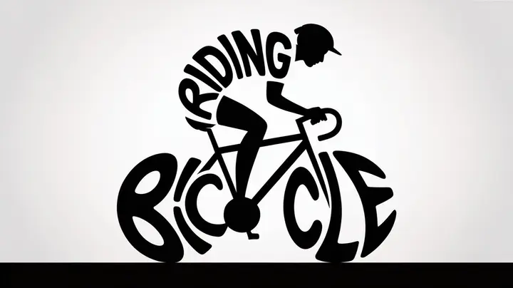
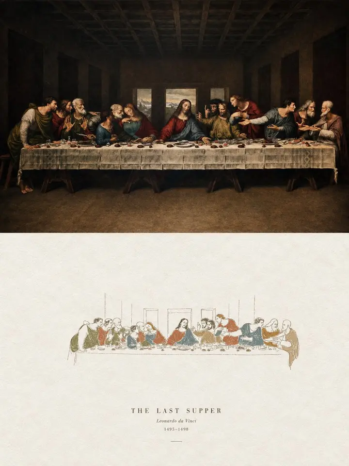
Turn each photo I upload into its own high-end design poster; no multi-image collages, one output per photo. 3:4 vertical layout, top and bottom sections at a strict 1:1 height ratio, each 50% of the frame.

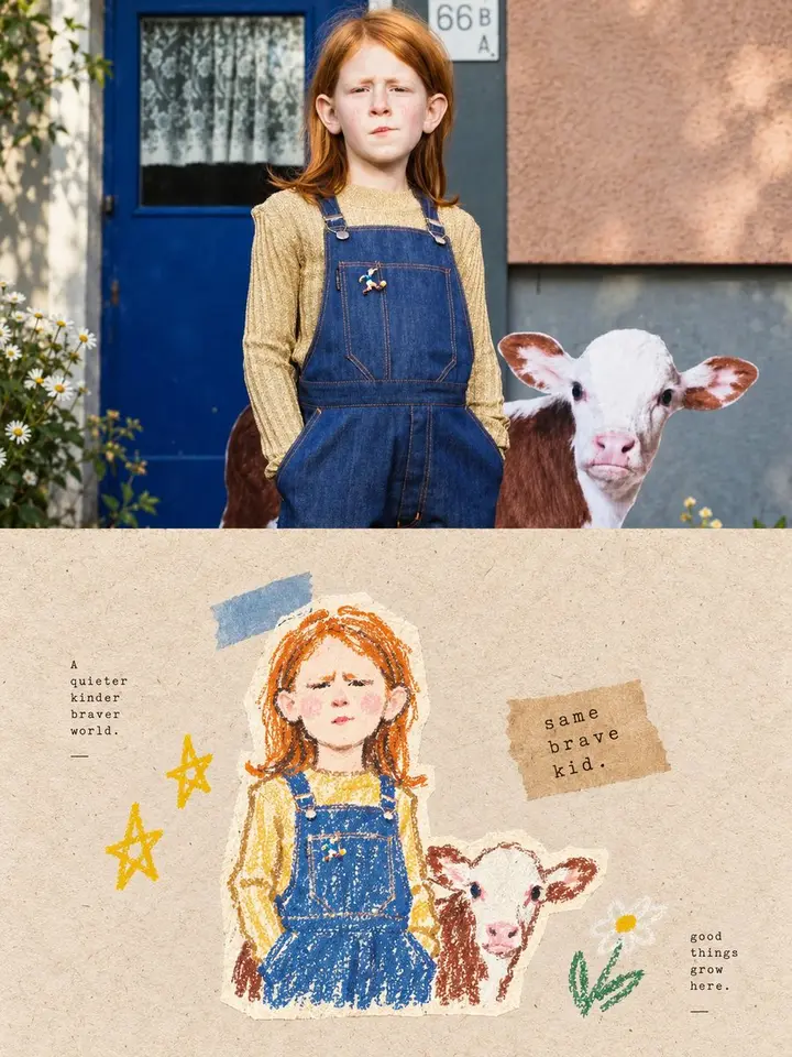
Top half: the original photo, keeping structure, texture, light and color mood, with light, refined travel-magazine grading; extend sky or ground if needed, never distort the subject.

Bottom half: extract the most recognizable **subject, outlines, pose and narrative relationships** and redraw the scene as a horizontal watercolor ticket stub combining a postcard and a ticket. Keep the key subject-setting relationship, clearly matching the photo above.

The ticket floats centered in generous ivory white space with a strict **large-left, small-right split**: about 74% watercolor on the left, 26% info stub on the right, separated by a vertical dashed, perforated or tear line. Everything follows one hidden grid. Thick matte watercolor paper, serrated edges, a soft shadow.

Left side: remix the photo's colors into a **bright, low-to-mid saturation soothing palette**: sage green, misty blue, pale blue-gray, cream yellow, warm sand, soft terracotta. 2-4 related hues for airiness, a tiny warm accent on the subject. Bright, clean, translucent; avoid gray haze, heavy browns and garish clashes. Light strokes, paper showing through, soft blooms, subject sharper than background. No realistic shading.

Right stub: a restrained **geometric info layout** with a few fields such as DATE, PLACE, SUBJECT, MOMENT, FIELD, NO., plus dates, numbers, short rules, coordinate-style digits and one round stamp, all aligned to a shared left edge and baseline with clear hierarchy. The postmark may slightly overlap the divider. For non-travel subjects, PLACE can become object, season or mood.

Overall: premium travel postcard, vintage ticket, artist's journal and modern editorial design; fresh, gentle, calm, orderly and collectible. Avoid dingy tones, loose layout, heavy decoration, realism and templates.